None of the people doing these themes seems to have a clue about visual design. If it looks like garish vintage video game, kewl.
Foggy's Progress - a record of improvements to the forum
-
pipistrelle

- Posts: 6822
- Joined: Mon Feb 22, 2021 11:27 am
Re: Foggy's Progress - a record of improvements to the forum
-
Foggy

- Dick Tater
- Posts: 9623
- Joined: Mon Feb 22, 2021 8:45 am
- Location: Fogbow HQ
- Occupation: Dick Tater/Space Cadet
- Verified: as seen on qvc zombie apocalypse
Re: Foggy's Progress - a record of improvements to the forum
I improved Carbon some. New logo, got rid of the useless bar that said our name and motto, got an Active Topics link at top and bottom of every page, it's improved.
Moving on, lemme look at the stats, see how many people are using what.
Moving on, lemme look at the stats, see how many people are using what.
 We went for a ride,
We got outside,
The sand was hot,
She wanted to dance ...
-
Foggy
- Dick Tater
- Posts: 9623
- Joined: Mon Feb 22, 2021 8:45 am
- Location: Fogbow HQ
- Occupation: Dick Tater/Space Cadet
- Verified: as seen on qvc zombie apocalypse
Re: Foggy's Progress - a record of improvements to the forum
Almost missed that, but yes, that's probably the best answer. I will do that from now on. And if something is really important (in my feeble imagination), I might do bold and red text. I think them weirdos who use dark themes can see that OK.
So Andy, here's a question. Which is more readable in a dark theme, standard red or Fogbow Admin Red?
We went for a ride,We got outside,
The sand was hot,
She wanted to dance ...

Re: Foggy's Progress - a record of improvements to the forum
Fogbow Admin Red.Foggy wrote: ↑Sat Jan 08, 2022 12:08 pmAlmost missed that, but yes, that's probably the best answer. I will do that from now on. And if something is really important (in my feeble imagination), I might do bold and red text. I think them weirdos who use dark themes can see that OK.
So Andy, here's a question. Which is more readable in a dark theme, standard red or Fogbow Admin Red?
"Choose your leaders with wisdom and forethought. To be led by a coward is to be controlled by all that the coward fears… To be led by a liar is to ask to be told lies." -Octavia E. Butler
-
northland10

- Posts: 5725
- Joined: Mon Feb 22, 2021 6:47 pm
- Location: Northeast Illinois
- Occupation: Organist/Choir Director/Fundraising Data Analyst
- Verified: ✅ I'm me.
Re: Foggy's Progress - a record of improvements to the forum
Ah, I forgot Fogbow has a brand identity with Admin Red and Mod Green. It should properly be expanded with full approved fonts and color palettes (with leadership colors/primary colors/alternative shades) along with alternatives if the primary font is unavailable, which it usually is. There should then also be a manual about which fonts are used for headers, and text, and also how to properly use the colors in the correct order. Also, logos (or brands, master brands, marks of leadership, etc) should have have very specific rules of usage and define distance from the log on all directions and the proper color listed by Hex, RGB, and for printed and physical items which do not have, PMS (Pantone Matching System).
Then change it a year and a half later.
All this talk about readability reminds me of a rule I made for students at one point. Penmenship was not a big issue for me as it would be sort of hypocritical given my sloppy handwriting. However, papers and tests had to be done in black or blue ink, or pencil. A nice solid green might be fine but absolutely no gel pens. If they were turned in with gel pens I would not bother to read and it becomes a 0 (a silvery one turned in was the final straw to me making that rule). I told them silver or fluorescent orange are fine for passing notes but not on assignments. I was doing music and basic theater arts so they should have pencils anyway.
101010 

Re: Foggy's Progress - a record of improvements to the forum
And I absolutely hate it because I can't read it without using my mouse to select the offensive red text. What's wrong with black text on yellow that does not work for people as highlighting -- is that not what we do in the real world?
-
bill_g

- Posts: 5516
- Joined: Mon Feb 22, 2021 5:52 pm
- Location: Portland OR
- Occupation: Retired (kind of)
- Verified: ✅ Checked Republic ✓ ᵛᵉʳᶦᶠᶦᵉᵈ
Re: Foggy's Progress - a record of improvements to the forum
Whenever I highlight things on the screen, I have a tough time cleaning it off later.
Pro tip: Don't use Mr. Clean Magic Eraser. Trust me on this.
Pro tip: Don't use Mr. Clean Magic Eraser. Trust me on this.
Re: Foggy's Progress - a record of improvements to the forum
It doesn't work too well in creamy.
Re: Foggy's Progress - a record of improvements to the forum
I'm good with whatever works best for the most people.
"Choose your leaders with wisdom and forethought. To be led by a coward is to be controlled by all that the coward fears… To be led by a liar is to ask to be told lies." -Octavia E. Butler
-
Foggy
- Dick Tater
- Posts: 9623
- Joined: Mon Feb 22, 2021 8:45 am
- Location: Fogbow HQ
- Occupation: Dick Tater/Space Cadet
- Verified: as seen on qvc zombie apocalypse
Re: Foggy's Progress - a record of improvements to the forum
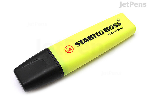
But I explained above, several of the styles do NOT use black on yellow.
They use WHITE ON YELLOW. It looks like this: White text on yellow background
Can you see that OK? 'Cause if not, then there's still a problem with highlighting on some of the themes.
Northland10's plan is adopted in it's entirety, and I expect his full report on my desk first thing Monday morning. Thanks, buddy.
We went for a ride,We got outside,
The sand was hot,
She wanted to dance ...
-
Kriselda Gray

- Posts: 3125
- Joined: Sun Nov 28, 2021 10:48 pm
- Location: Asgard
- Occupation: Aspiring Novelist
- Verified: ✅
- Contact:
Re: Foggy's Progress - a record of improvements to the forum
I like HexagonFoggy wrote: ↑Fri Jan 07, 2022 9:30 amI like Graandview, except for one thing - its really hard to tell which threads have new posts and which threads don't, the little tiny red flag is all you get and my poor ol' eyes can't see so well. Other than that, I really like that one. But try Hexagon and tell me what you think.

Re: Foggy's Progress - a record of improvements to the forum
I like Hexagon as well.
Avatar was a photo I took by Killary Fjord in 2005. Killary Fjord is in Northern Connemara, Ireland.
Re: Foggy's Progress - a record of improvements to the forum
No, it looks horrible. The stylesheets are mucked when it comes to highlight -- and red text on Creamy is also horrible. It's not your fault, Foghorn -- just shity design by the creators.Foggy wrote: ↑Sat Jan 08, 2022 4:11 pm
But I explained above, several of the styles do NOT use black on yellow.
They use WHITE ON YELLOW. It looks like this: White text on yellow background
Can you see that OK? 'Cause if not, then there's still a problem with highlighting on some of the themes.
Northland10's plan is adopted in it's entirety, and I expect his full report on my desk first thing Monday morning. Thanks, buddy.
X-Creamy works perfect with the highlight tag. Hiya
-
John Thomas8

- Posts: 5228
- Joined: Mon Feb 22, 2021 7:42 pm
- Location: Central NC
- Occupation: Tech Support
Re: Foggy's Progress - a record of improvements to the forum
It'll take a bit of getting used to, but I like the "Carbon" setting.
-
Kriselda Gray
- Posts: 3125
- Joined: Sun Nov 28, 2021 10:48 pm
- Location: Asgard
- Occupation: Aspiring Novelist
- Verified: ✅
- Contact:
Re: Foggy's Progress - a record of improvements to the forum
Carbon's not bad, though my Goth-y side like Horizon more 
-
John Thomas8
- Posts: 5228
- Joined: Mon Feb 22, 2021 7:42 pm
- Location: Central NC
- Occupation: Tech Support
Re: Foggy's Progress - a record of improvements to the forum
Didn't see a Horizon choice 
We use yellow highlight in the sportsball sections, white text/yellow highlight/60 yo eyes isn't working.
We use yellow highlight in the sportsball sections, white text/yellow highlight/60 yo eyes isn't working.
-
keith
- Posts: 3765
- Joined: Mon Feb 22, 2021 10:23 pm
- Location: The Swamp in Victorian Oz
- Occupation: Retired Computer Systems Analyst Project Manager Super Coder
- Verified: ✅lunatic
Re: Foggy's Progress - a record of improvements to the forum
I tried Hexagon, it was OK until I looked at a post with white on yellow highlighting.Kriselda Gray wrote: ↑Sat Jan 08, 2022 4:18 pmI like HexagonFoggy wrote: ↑Fri Jan 07, 2022 9:30 amI like Graandview, except for one thing - its really hard to tell which threads have new posts and which threads don't, the little tiny red flag is all you get and my poor ol' eyes can't see so well. Other than that, I really like that one. But try Hexagon and tell me what you think.
The 'tiny' new post flags in Graandnew are ameliorated somewhat if you use the new posts search instead of the active posts.
Has everybody heard about the bird?
-
Foggy
- Dick Tater
- Posts: 9623
- Joined: Mon Feb 22, 2021 8:45 am
- Location: Fogbow HQ
- Occupation: Dick Tater/Space Cadet
- Verified: as seen on qvc zombie apocalypse
Re: Foggy's Progress - a record of improvements to the forum
For those who know what a hex code is (for color selection), standard red is #FF0000 and Fogbow Red is #AA0000.
'Course, hexadecimal is used for a lot of stuff. Anybody see The Martian?
'Course, hexadecimal is used for a lot of stuff. Anybody see The Martian?
We went for a ride,We got outside,
The sand was hot,
She wanted to dance ...
-
northland10
- Posts: 5725
- Joined: Mon Feb 22, 2021 6:47 pm
- Location: Northeast Illinois
- Occupation: Organist/Choir Director/Fundraising Data Analyst
- Verified: ✅ I'm me.
Re: Foggy's Progress - a record of improvements to the forum
After trying different colors, it looks like for a highlight color red seems to work the best for most styles, including dark ones. I will try to use that in the future.
101010
Re: Foggy's Progress - a record of improvements to the forum
Nope.northland10 wrote: ↑Sat Jan 08, 2022 8:05 pm After trying different colors, it looks like for a highlight color red seems to work the best for most styles, including dark ones. I will try to use that in the future.
- 391893jjs.png (28.85 KiB) Viewed 1347 times
-
pipistrelle
- Posts: 6822
- Joined: Mon Feb 22, 2021 11:27 am
Re: Foggy's Progress - a record of improvements to the forum
Psychologically red is a terrible color.
-
RTH10260

- Posts: 14680
- Joined: Mon Feb 22, 2021 10:16 am
- Location: Switzerland, near the Alps
- Verified: ✔️ Eurobot
Re: Foggy's Progress - a record of improvements to the forum
Try color code PINK.northland10 wrote: ↑Sat Jan 08, 2022 8:05 pm After trying different colors, it looks like for a highlight color red seems to work the best for most styles, including dark ones. I will try to use that in the future.
Re: Foggy's Progress - a record of improvements to the forum
Correct. Red is a terrible color for this from the forum standpoint. It invokes alarm -- which is why it is used in "red lights" and emergency vehicles.
Re: Foggy's Progress - a record of improvements to the forum
Red.
- 768fea.png (35.77 KiB) Viewed 1318 times
-
MN-Skeptic

- Posts: 3077
- Joined: Mon Feb 22, 2021 1:03 pm
- Location: Twin Cities
Re: Foggy's Progress - a record of improvements to the forum
Growing up with a color blind (the more common red/green variety) brother, I’m very conscious of the fact that red looks brown to a sizable number of people and is a very poor choice as a highlight color. My recent college graduate niece is in film production and showed me a short promotion film she had just made. I told her run it by her dad because I could see potential areas where he would miss something she was trying to highlight.